Cibes is moving up in the world
Same company. New look.
Cibes is one of the world’s largest manufacturers of low-speed lifts and the company continues to move up in the world. Now Cibes is launching a new logotype to match the positive development of the company.
In the past few years, Cibes in Europe and Asia expanded greatly and product development has gone into overdrive. The launch of the new logotype marks out a new path for Cibes as a modern, trendsetting company with a strong focus on quality and design.
“Last year, we achieved a large turnover, which proves that our investments worldwide are starting to bear fruit. The new logo is our way to show the world and our own staff that we are a fast-growing company in touch with the latest trends in architecture and interior design”, says Chris Roggeband, Sales & Marketing Director at Cibes.
Old LOGO
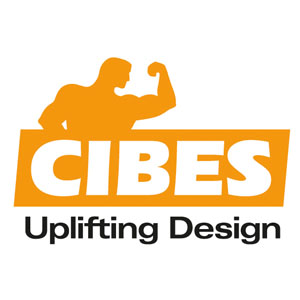
New LOGO

Cibes’ new logotype is designed by the Dutch company Matisse. It combines the simplicity of Scandinavian design with the vertical movement of a lift. The ascending “e” of the logotype is both a playful allusion to the moving figures of the level indicators during lift travel and a tribute to a company on the up. The look of the logotype is new, but the company has chosen to keep the characteristic orange colour of Cibes.
”Orange is a colour of joy, positivity and creativity. We wanted to keep the Cibes orange because it is so instantly recognizable. Then again, the tagline bringing people together is completely new and illustrates what we want our lifts to do; to create new places for people to meet and socialize. This is also the theme of the films which will be released when we launch our new logo”, Chris Roggeband continues.
The old Cibes logotype, high-lighting lifting power and strength, was the symbol of the company since its foundation in 1947 by Civil Engineer Bertil Svedberg. Back then, the company manufactured lifting equipment for the Swedish industry. Nowadays, Cibes makes screw-driven passenger lifts and 80% of the production is exported. This is a development which requires a new logotype. Cibes is moving up fast in the world and now has the visual identity to match.
The upgrading of the Cibes New LOGO and slogan is an important part of the upgrading of the CIBES brand, which can better reflect the professionalism of the CIBES brand and convey the brand values and sense of mission. In the future, CIBES website, wechat accounts, brochures materials, product packaging, products and other mareting material will be replaced by the new LOGO.At the same time thanks all customers and partners’ support and caring , we will continue to provide you with quality service!


